LO1
|
How effective was your research? Explain why.
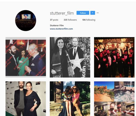
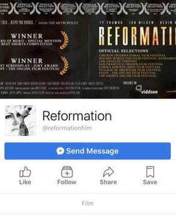
The process of me researching into different ways in which I could promote my film, via social media and an online website, was done effectively. By this I mean the information I collected will overall help my online campaign and make it more successful. For example, I researched three different short film websites. I evaluated these websites in terms of how easy and accessible they were to use, what they had on them and how much the websites promoted the film. From this research I looked at the element within the websites that I liked the best, for example the film ‘Reformation’ had loads of behind the scene interviews with cast and crew, I thought this gave an insight into the making of the film and therefore engaged the audience more. Another thing in which ‘Stutterer’ did was simple set up with tabs directing the user to specific information like social media. This research allowed me to note down the elements in which I thought worked well and apply them to making my own short film website. My primary research was done effectively, this research was mainly based around social media and promoting I can do on these online platforms. I discovered the most popular social media sites, Instagram and then Facebook, from this information I can defer to make pages on these sites to get mass amount of people using them. Overall, the information from the survey will allow me to make decisions on how to promote my film as I will be able to see what people prefer things to be promoted on. Overall, this research will enable my campaign to be more successful and get mass amount of people looking up my film. |
|
|
Which elements of your research were particularly useful? Explain why.
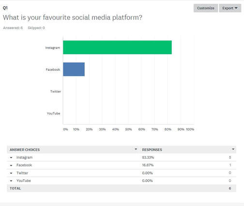
One element of research in which I found useful was looking into the different social media accounts for that specific film. Most films have all the main social media accounts, Instagram, Facebook and Twitter, and when researching into them I discovered how well branded everything was on these sites. For example, to make the film look professional the accounts will have the same profile picture and same information on them. I think this makes the accounts appear more professional and promotes the film more. Another thing I have noticed on the social media accounts is how the themes of the accounts are created to make everything look aesthetically pleasing and therefore visually appealing for the audience. Every picture they post or caption they write in some way is persuading the audience to watch their film or proving how amazing the film is. This can be done by showing off reviews or awards the film has one or even giving sneak peek teaser trailers, everything that is posted and done with a motive. Overall, I thought this was very useful as prior to this research I didn’t know how I would go about formatting a social media page for a film or what to add on the page. Yet, by doing this research I feel a lot more confident in creating my own and them being successful in advertising my film to the audience in a correct manner. Another part of researched which I thought was useful was the primary researched in which I conducted surveys on social media. I thought this was useful as I asked questions about social media and what platform was the most popular and how often to people use it to get and insight into how being use social media as a whole. From this information I could base my whole website and social media accounts around it, for example due to 83.33% of people asked saying they like Instagram the best out of every social media site, this told me I had to create an account of Instagram rather then YouTube. These results were very helpful in making decisions. |
|
Which elements of your research were weak? How did this impact your planning/production?
A weaker element of my research was finding online websites for specific films. Initially, I struggled trying to find any website online for any films, this was because I was researching into independent short films which weren’t made my established professional companies. Due to this many film didn’t have their own websites which were promoting anything. However, I did manage to find three websites for films, yet I don’t think my research was reliable or as good it could have been if I was researching more established films. Yet, this meant I struggled finding what was typically on an online website and what things I should include. Even though the three website I researched had specific elements to them for example ‘Reformation’ had many behind the scenes videos. Yet, none of the others had that, all three websites were very different which didn’t make it very clear what I needed to add to my website. This impacted the planning of my website as I wasn’t completely sure what I needed on my website to promote the film to people, to solve this problem I picked out the things in which I liked from each individual website. For example, I wanted to add an awards page/ review page of my film, I wanted a place for the trailer, a behind the scene footage section and a place to the social media of my film. Overall, if this researched was done better I wouldn’t have to guess what to put in my online website and the whole producing part would run a lot smoother. 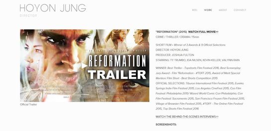
|
|
|
Explain how your research helped you to develop your ideas.
My research helped me to develop my ideas in terms of knowing what to post on social media. I could see what other film production companies or short films were posting, for example a teaser trailer and use this on my own social media accounts. I was able to understand what worked well in promoting and how to brand your film online for it to be perceived as professional. I also understood via other online websites of short films how to lay out a film website. For example, you don’t want to give out too much information so that the film looks boring, yet you want to post behind the scenes videos and teaser clips to entice the audience into watching it. To do this you need to lay out the website correctly with specific tabs for different section. All, this research did help in understanding promoting and enable me to develop new creative ideas in doing so. |
|
What would you do next time to improve the weaker elements?
Next time, when researching into promoting a film I will collect more primary research to gain a more rounded understanding of people views on social media and promoting films. As when doing my research, I discovered via my survey that 83.33% of people asked were in the age range of 11-20. This means my research isn’t that reliable as it doesn’t represent opinions of the entire world. This is due too only one generation filling out the survey, and this generation according to research is in favour of technology and uses it often. This means the results are bias in favour of using social media over ‘typical’ advertising methods. Also, the younger generation, between 11-20, may be in favour of one social media platform then the other, in this case Instagram is more popular. However, it may be not overall the most popular platform in terms of everyone. To improve this weaker area within my research I would firstly send my survey out to not only college students but as many people of as many ages as possible. This means the results won’t be bias and we can see what everyone is thinking. Secondly, I would of done Vox pops, this is when you question people directly, this can work more beneficial as you can change the questions around in order to get response you want to hear or push for the answer. When doing all this research I would then decide on how I should go about promoting my film as the results would be a better representation of what everyone wants. This will make the promoting method more successful and work better. |
|
Survey Results
I wanted to improve my website in order to make it more accessible for people to use and thus promote my film better. In order to understand what I needed to improve on my website I decided on making a survey. On this survey I would ask people what they thought went well and what they thought didn't go well and how they would overall improve the film. I created this survey on the website called SurveyMonkey and then emailed it out to fellow classmates and people across my own personal social media, in order to get a diverse and large response. This is the results from my survey and I am going to explain how these results are helpful in improving my website and thus promoting my film better.
|
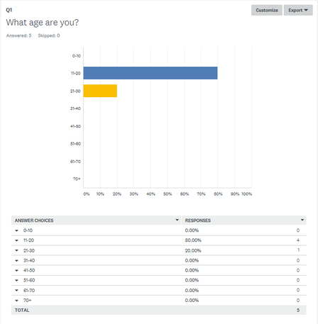
The first question for the survey is 'What age are you?' which doesn't help in terms of how to improve my website, yet from this question I can defer the age range of the people answering the survey and what that age range want to see. For this answer I received a very one sided response. The highest response from the survey was 11-20, in which 80% of people asked said they were in this age range. The second highest result was 21-30 which 20% of people asked said. None of the other age ranges got a result, this meant that the survey was very restricted to younger people answering it. This could mean that the results are more bias to what typically young people are looking for in a website. For example, younger people may want more interactive and less formal type of website. Yet, this isn't a good representation of what everyone as a whole wants to see on my website. |
|
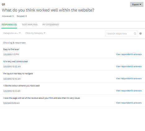
For question two I asked the question 'What do you think worked well within the website?'. I got many different responses which said what worked well on my website. One person said 'The layout was easy to navigate', this was really good feedback to receive because the most important aspect to me is being able to navigate around the website .Another said 'I love the pages with all the reviews about your film and also that its very visual', from this information I can defer that most people prefer a visual way of learning with images instead of text. From these results I can defer that my website is accessible to use and is structured effectively. Also, I know that the colours work effectively in terms of my brand and fitting the short film and what it looks like. |
|
|
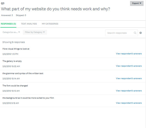
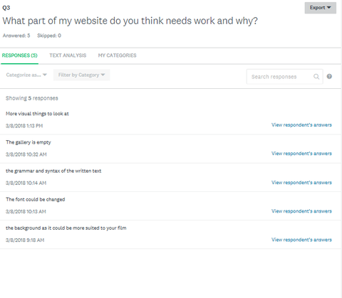
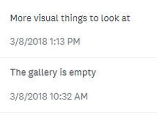
For question three I asked the question 'What part of my website do you think needs work and why?'. One persons said 'the gallery was empty' and another said 'More visuals and things to look at'. From these results I can defer that I need to make my website more visual and pleasing to the eye. This will attract people into using my website more and thus promote the film further. Another part of feedback in which I received was the font needing to be changed, this may be due to not being to read or for the users not able to understand what it is saying. I will do improvements on my website in order for it be better for people to use and better at promoting my short film 'CHARLIE'. |
|
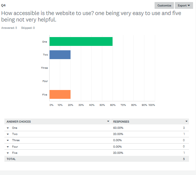
For question four, the question was 'How accessible is the website to use? One being easy and five being not so helpful' For this question I got a split response, the most popular response was one out of five which had 60% of people asked agreeing with it. This shows overall the website is easy to use, this may be because the various tabs I made directing the audience around the website. Another 20% of people said two out of five, yet a following 20% said five out of five. This meant some people didn't find the website accessible to use. To change this in order to make it better I will add in buttons and links which go to specific pages, this way everything will be in its set places and people will be able to understand it easily. |
|
Improvements
IMPROVEMENT ONE
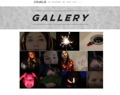
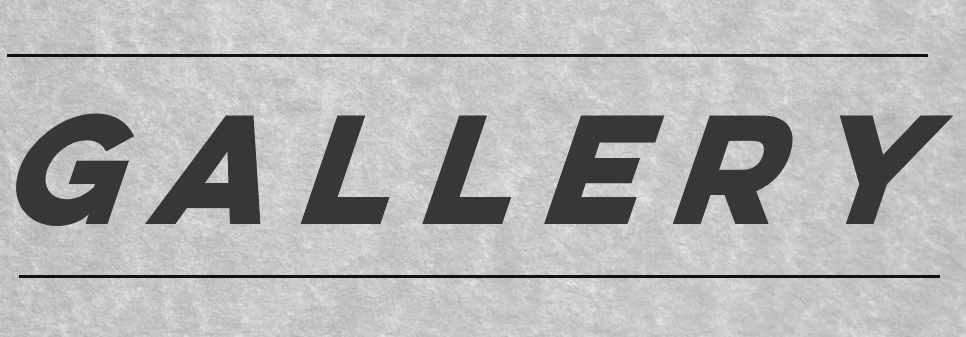
This was part of the feedback in which I received via my survey. They told me to make my website more visual and add pictures from behind the scenes and stills from the film for the website. This was to make the website appear more visually appealing and thus engage the audience more, it makes the film scene more creative and less bland, thus enticing the audience to watch. The pictures shown below are a before and after of the gallery page on my CHARLIE website, the first image there is no pictures at all and the page appear more boring. However, in the second picture I added in a collage of pictures in a 'gallery' way, establishing some of the best work of mu film. I even animated the pictures to move into place when you go onto the tab for the gallery, this makes the page more interactive and better overall. I think this improvement was a success as the after picture looks a lot better for promoting my film. I think the survey was very helpful in finding out in what to improve.
|
BEFORE
|
AFTER
|
IMPROVEMENT TWO
The second feedback I received from my survey was the improvements of texts on website, this was generally because some text was unclear and people weren't able to read it to understand this. To solve this problem what I did was changed the font into the boldest and strongest colours I could find. This way people could read the text easily and were able to follow the website effectively. The first picture is the before of the text and the second picture is the after of the text. As you can see from the before the text was in the style of handwriting and was very flowly,even though this did look pretty, it wasn't eye gripping and too the point which is what I wanted. I changed the colour to black and changed the background to a grey tone, this made this section stand out. I then put it in the font Anton and typed it up in all capitals, this meant it was easily accessible and people could understand it quickly. Overall, I think this made massive improvement to my work and made my website appear more powerful and professional.
|
BEFORE

|
AFTER
|
IMPROVEMENT THREE
Another improvement in which I received was adding in my social media clearly and effectively onto my website. Prior to this feedback I didn't have the links on my website, yet after getting this feedback I added in buttons which I added in hyperlink which when pressed took you directly to the web page of that said social media link. This meant the audience could easily look over the social media pages, I made my social media as active as possible as this would generate excitement for the release of my film and it also acted as free promotion in itself. Overall, by adding in social media it enabled me get more interactive with the viewers and appear more professional online.
IMPROVEMENT FOUR
The fourth feedback in which I received from my survey was asking me to change the background of my website in order for it to me more directed to the film and what the brand of the short film 'CHARLIE' this will make it more relevant. Prior to this I used the backdrops in which Wix, the company I was using to make the website, had provided. Yet, these backdrops didn't relate with the film and go with themes through out the film. Therefore, they had to be changed in order for the website to make sense. The photo on the left if prior to making any improvement and the photo on the right is after the improvements. I switched the photo as the backdrop to a still from the film, this allowed the audience to see the brand throughout the website and see how professional it looked. Overall, I thought this feedback really helped in making the website look more professional and thus be more inviting and nice for the audience to look at.
|
BEFORE
|
AFTER
|
Comparison with professional promotion
COMPARSION ONE
|
Profession website
|
My own website
|
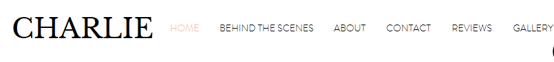
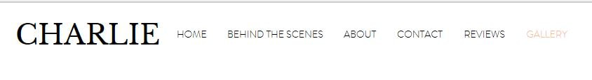
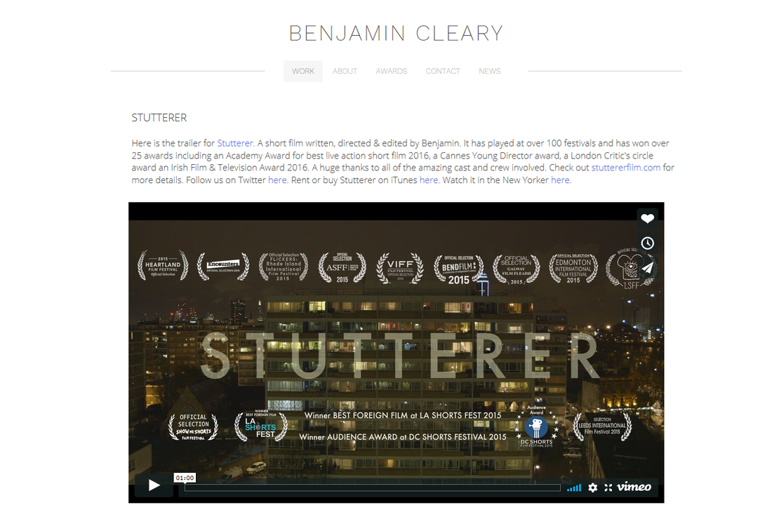
This is the comparison between a professional website made by a short film maker and my personal student made short film website. As you can see from the images below, my navigation tool bar is very similar to the professional one. From doing research I discovered how much I liked the navigation bar for the official website of 'Stutterer' this was because it was accessible and easy to use. This is because it had tabs for each specific page of the website which means you could find specific information easily and quickly. Yet, my navigation tool differs from the professional one in terms of font and how clear it is to read. When doing my primary research I discovered that people are looking for bold fonts and to be able to understand the information clearly to allow them to understand it fully. This meant I put my title in all capitals with a bold font on, I also added an effect where the tab page you are on turns the colour of orange, this meant people know what page they are on and can follow easily. I think my navigation bar is more successful then the professional only due to it being clearer to read because the bolder style of fonts.
COMPARISON TWO
|
Professional Website
|
My own website
|
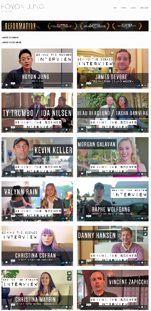
This is the behind the scene tab for the professional film in comparison to my own personal short film. As you can see there are many similarities between my own short film behind the page and the professional, this is because I formatted by videos in a similar way in order for them to be more interactive and engaging for the audience. I really liked how the short film 'Reformation' achieved this and it worked effectively for them, therefore I took inspiration in my own work. However, I didn't like how plain the backdrop for the professional film was, it didn't look personalised and it didn't relate to the branding of the film. Therefore when making my own behind the scenes tab I added a grey textured background in order for the page to be more visually pleasing. Another thing in which I did, which the professional website didn't, was I added animation on my YouTube videos and font. This meant that when you click on the page text flies across the screen and becomes more eye catching and draws attention to specific parts of the page. I animated the YouTube videos to automatically play once you go on the page so it will catch the users eye and they would be more encouraged to watch the videos. However, I do think the behind the scenes page on the professional website is more successful, this is due to it having more material on it. This makes the film website look more completed and more action packed, if I did this task again I would make more visual videos to put on my behind the scenes page, this will allow the page to become more engaging to the audience searching it.
COMPARISON THREE
|
Professional website
|
My own website
|
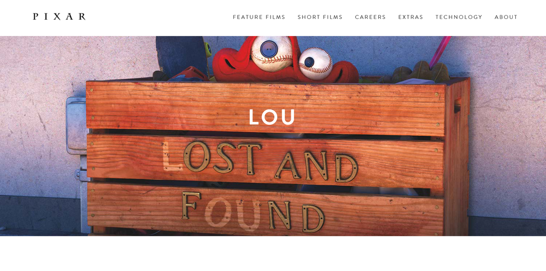
This is the comparison between the professional short film home page and my own personal website home page. I based my own website home page upon the 'Lou' short films home page, I found that the 'Lou' short film page was engaging and worked effectively with the film. The still image from the film was used as the background which helped in introducing the brand to the audience, the bright colours allows the audience to understand the theme is happy and is going to be a feel good film. I took inspiration for my own layout from this film website by adding an image from my film. I chose a bold font to go over the top of the images to introduce the film. I thought my own home page was more successful then the professional one, this is due to the text being clear for the audience and really imprints the film in there heads in an engaging way. In comparison to 'Lou' home page which uses a small that isn't eye catching to look at. I also, added an animation to make the font move, therefore attracting the audience to look at this specific place on the page more.
Evaluation
|
Justify your choices - colours / layout and design - why have you used it and does it work
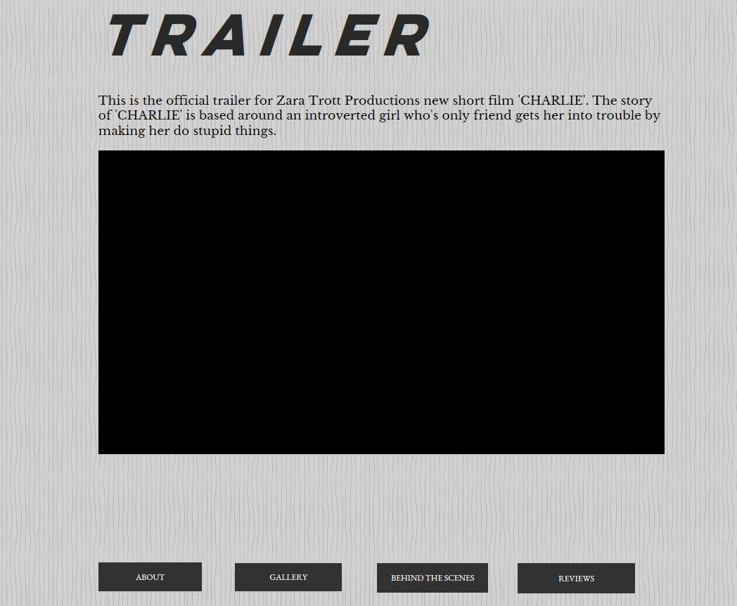
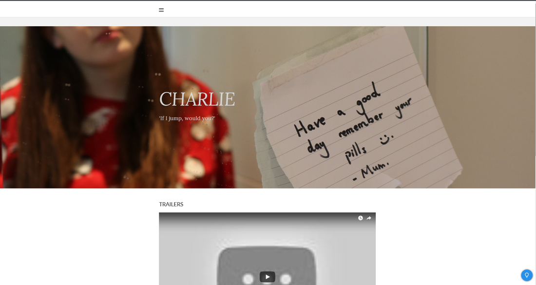
For my short film’s website, I created it carefully to receive mass appeal from the audience and to promote the film further. The website is very key to promoting the film and if it doesn’t look professional or good then the film will not reach the success it deserves. To make my website look professional I achieved this through the use of my colour scheme, the visuals I put on and making the website accessible for everyone. Firstly, I decided to use a very minimalistic dark colour scheme for my short film. This was because I wanted the audience to understand that my film wasn’t up beat- it’s a psychological thriller covering mental health issues, I wanted the tone of the website to be the tone of the film. By doing this I am allowing the audience to understand the vibe of the film, as if I had a bright colour pallet this would be miss leading to those looking at my website. Personally, I think the simplistic colours make the website look more professional and stand out, the bold black lettering against the grey toned back drop really is eye gripping for those searching the website. Another stylistic choice I chose was the use of images and video footage, I wanted my website to have as limited text as possible as people don’t have the attention span to read long passages of text. To get around this problem, I created an interactive way of finding out about my film, I added video diaries, behind the scenes video and cast and crew interviews in order to show rather then tell the audience information. This also made the website look slicker as massive sections of texts weren’t everywhere on the site. From my research I have discovered that people prefer to see things visually through pictures and videos, this is another reason why I decided to format my website like this. To allow my audience to accessibly use my website I added in a navigation bar on the top of the page, this has many tabs to different sections of the website for example behind the scenes and contact information. It makes using the website easier as you know where to find certain information quickly. I think this is effective for those who just want to find specific information about the film. Overall, the choices I made when creating my website were for the reasons for it to be easy to use and visually pleasing, I think I have succeed well in the creating process of my website. |

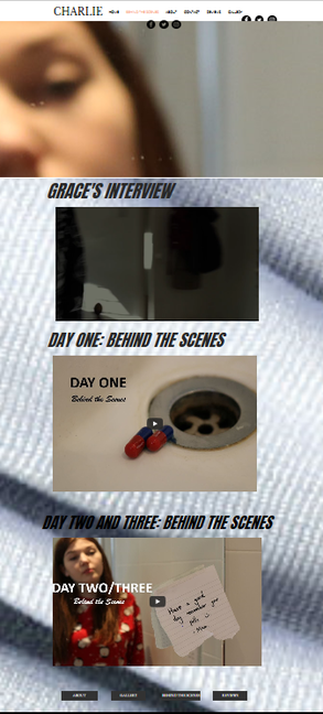
This screen grab illustrates what I mean about the dark grey colours, which illustrate the themes of the film. I used dark strong font as the title in order for the website to be clear to use. I also added in lots of pictures for the page to be visually engaging.
This is the navigating tool at the top of the page on each page. It states clearly the tabs that you can pick which will take you to another page. When the tab is covered in yellow that means you are currently on that tab, in this case it is on Gallery.
|
This screen grab shows how I have branded my website from the colour palette to the font. Everything is the same through out the website which makes it look very professional and clean.
This is a screen grab of the font I decided to use through out my website. It looks very professional due to it being able to be read easier.
|
Discuss whether you feel that you have effectively branded your online promotional package in keeping with your Unit 6 production
I think I have been mostly effective in branding my online promotional package in keeping with unit six productions. My online website illustrates a similar look and feel to what my short film does, I used very dark grey minimalistic colours to show that this production isn’t happy and covers dark topics, topics of mental health and suicidal thoughts. I wanted the viewers using the website to feel palpable when looking at my website. The repetition of the similar shades and image layouts makes the website appear more professional, a professional website it more likely to get a better mass response from the audience. However, I do think that my trailer isn’t very fitting with the brand. I have quite up beat music as the trailer music and I didn't choose very graphic or tense shots from the film, used the shots of people smiling and laughing. This made the film appear to be more of teen drama rather then a psychological thriller. When editing I didn’t want to give too much of the plot away, yet by doing so I twisted what the film was and made it look different to entire brand and film. To improve this, I would change the song I used for my trailer and add more of the gripping dark shots in, this then will follow the brand of the film. A positive in which I did for branding was using the same three images, of different scenes in the film as posters and anything within the promotional campaign, this meant when people saw these images they knew it came from the film, it was the typical image for the film. However, I didn’t add the personal touch to my brand my creating a logos for the short film, this meant it didn’t look that professional and the film couldn’t be identified straight away. Because it didn't look that professional in terms of logos many people wouldn't continue to use the site because they think the film/ promotional package is amateur. I think to improve in the future I would make a logo for the film as the audience would be able to recognise it straight away from all my social media pages and online websites and put it against the film. This would get more people to watch the film as they may have seen a poster with the logo on but then see the film with the same logo and know that they are related. |
|
Discuss your audience's response to your website and social media
I received a lot of response, some good and some bad, about my website and social media for my short film. I used these responses as a guide to understand what was working and what wasn’t for my online campaign to perfect it as much as possible. I sent out a survey via SurveyMonkey I asked people what they thought was done effectively on my website, I got many different responses for this answer one being the layout was easy to navigate. This was nice feedback to receive as one goal I had when making my website was making it accessible for everyone and easy to use, I achieved this by adding in a navigation bar with tabs to specific sections of my website, for example behind the scenes, in which people click on to access. Another bit of feedback in which I received was about how well I used colours and images I used on my website, this was good feedback to receive as I wanted my website to look visually pleasing to the eye as this will attract more people to use and access the website. I used grey dark tones as the backdrops of my website in order to set the tone of the film and illustrate the vibe to the viewer of what type of film I was advertising- a dark psychological thriller. I did also receive some negative feedback for my website, one bit of feedback said I should change my fonts as they were unclear, and you couldn’t read them. This was helpful feedback as I then improved the font to a bold capital letter font rather then a flowy hand writing type of font. Overall, this made the font stand out and entice the audience more, I also added on animations onto the fonts, so they really caught the attention of the viewer. Another response in which I received said how my grammar in places where I had text was incorrect. This was useful to know as I could go back and carefully read through my work to change the mistakes I had written. Overall, by doing this it made my work sound and look a lot more professional, visitors to my online website would take it more seriously knowing someone took time in making everything written correctly and effectively. |
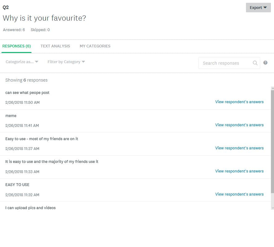
These are screen grabs of my survey, this is when I asked people about what they thought worked well and what didn't in order to improve.

|
|
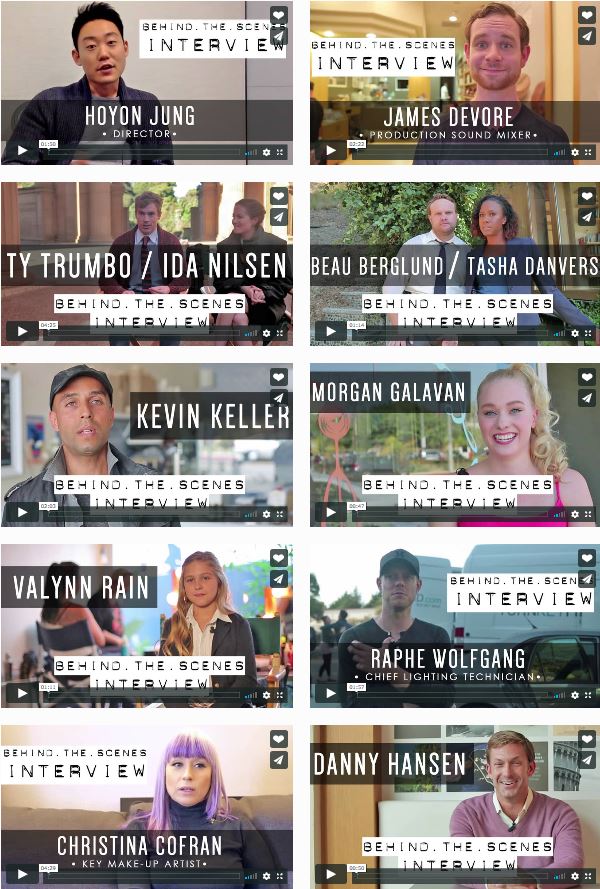
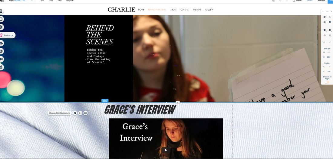
This is a screen grab of my website, as you can see from the image that I have only got one interview for my behind the scenes tabs. To improve I could of interviewed more people and got more footage for my website.

|
Discuss how effective you feel your promotional package is for your production
Overall, I think my promotional package was effective in places but needs work to be a lot more successful. In particular with my social media I don’t think I used it as effectively as I should have done, I didn’t post or tweet any messages out about my film or even post that many pictures. This is a shame because social media is a free tool and if very effective in gaining audience and drawing attention to a specific thing. Social media allows you to communicate with your followers and generate hype and excitement for the film, therefore without it you are losing that promotional aspect. If I create a promotional package in the future I will make sure my social media is a priority in making it look professional and showing of the brand, essentially this is where I will gain the most recognition. Other aspects in which I thought I could do better was the behind the scenes videos, I created three behind the scenes videos but only one was an interview. I think I should of planned more effectively and used my time efficiently in order to get more then one interview with the cast and crew, as the behind the scenes footage allows the audience to get to know the cast and align with them. It is very helpful in promoting films, so by only having one interview I was missing out on a big opportunity in gaining attention and promoting the film further. Moving on from the negatives, I thought my website was effective in promoting my film, this is because I made it as visually pleasing as possible by adding many photos and videos. I did this as I thought it would draw people into the website and make them look further and get to know the film. I added animation to my text and images so the page was very interactive and fun, I also made sure there was minimal text as this could appear boring to people. I think overall, my website was really effective in promoting my film, yet my social media pages wasn’t as strong. |
|
What would you do next time to improve your promotional package?
Next time to improve my promotional package I would focus more directly on social media. I would create the social media pages straight away and put content up on them every day, this could be anything from a video diary, pictures on shoot or even a trailer. By doing this I am engaging the audience with the film making process and thus making the audience become more invested in it. This means as an audience they are more likely to watch my film because they have seen the film making process, this way I am interacting and involving the audience more. I want to make sure with my social media that everything is branded effectively in order for the short film to look as professional as it can do online. For example, all social media platforms such as twitter and Instagram should have the same profile picture and bio information, they should also post the exact same pictures and captions. This makes the film as a brand look more professional and work more efficiently as you are spreading the message out to as many people as possible. This is because some people may not have certain social media site but have others. An adult is more likely to have Facebook account then an Instagram, yet by posting the same thing on each account you are promoting to the mass amount of people. Also, next time I would like to focus more on getting more footage for behind the scenes, I think its due to poor timing and bad planning that I didn’t collect as much behind the scenes footage to the professional standard I wanted it. Next time I want to get lots of cast and crew interviews as I had loads of random footage but no constructive conversation about the experience and reflection of it. If I get more interview footage it would improve my promotional package and make my website become even more interactive. |
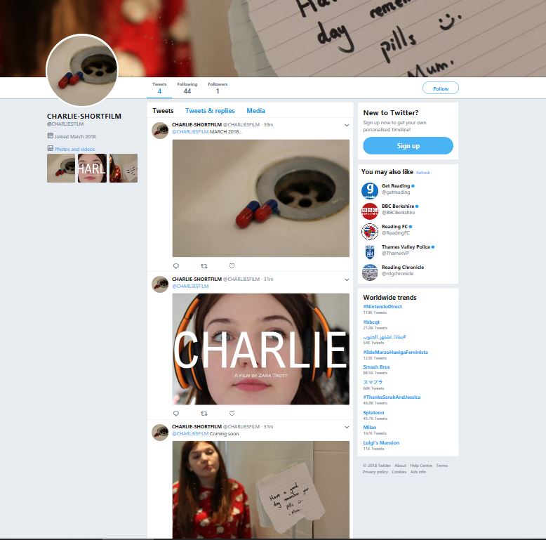
This is a screengrab of one of my social media pages. This screen grab comes from twitter. Next time I want to be more thorough and on top of my social media when promoting my film. As this will help to spread the message about the film further.
|
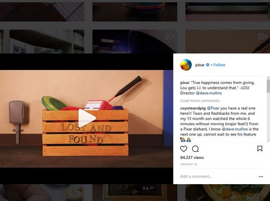
This was one of the short film website in which I looked at in order to give me an idea of what I wanted to make my website look like. I took different ideas from different website in order to make my website as successful as possible.
|
How effective was your planning? Explain why.
I thought my planning for my promotional package was effective because prior to going ahead and creating the website and social media pages I researched into different promotional packages made by short film makers and companies. For example, I researched into what conventionally was seen in a short film website and applied it to my own. This was effective in terms of acting as a guide in how to structure my promotional package effectively. However, I found it very difficult in finding websites for short films and when I did they were very different from one another, thus meaning I didn’t completely know what was correct when putting stuff on my website as all websites differentiated from each other. I didn’t know what was typically looked for in a website. To solve this issue, I just used all the parts I thought worked effectively in short film websites and applied them to my own, so I had the ‘best bits’. I effectively planned the lay out of my website by creating a mock layout beforehand. I did the mock layout on Weebly, I created a navigating board with tabs on it for different sections of the website and marked out where the behind the scenes footage and reviews would be. However, I found that Weebly layout wasn’t very interactive and wasn’t very visually pleasing. In order to find a solution for this problem I changed to Wix and created the actual website using Wix because it is better for interactive websites. By doing a mock layout I was able to understand what worked and what didn’t, and I could decide on how to create my online page effectively. This helped me in the long run as my website was very visually pleasing due to having loads of images on in and animation on texts and videos. My planning for the behind the scenes videos was very poor, I didn’t organise a time to decide on what behind the scene videos I wanted to take when filming. This meant when coming to the creating of the online promotional package I had limited footage meaning I couldn’t make as many videos as I wanted to engage the audience. Next time, I will create a plan to what I want to film and set myself time within my shooting schedule to get the behind the scenes footage done as it will help later on. Overall, I thought my planning could be improved greatly as this will help when I get to the creating stages of the promotional package and thus make my work better. |
|
Which elements of your planning were particularly useful? Explain why.
The element of my research in which I found particularly useful was the mock layout of my online website on Weebly. I think this by creating a mock I could get comfortable with the making process of a website, I could discover on my own what I thought worked well and what didn’t and lay it out in different ways. It was a process of trial and error which allowed me to get an idea of how my website would look. From this planning I discovered that I didn’t want to use Weebly as the host website for my website, this is due to Weebly not being very interactive. To solve this problem, I changed to Wix, Wix was a better fit as it a lot more complicated then Weebly I had the freedom to make my page exactly how I wanted it to look. I added animation on the text to engage the audience and added strips in the background to bring colour into the page. I think the planning was useful because by the time I came to create my website I knew exactly what is was going to look like due to having a rough base of a website. This saved a lot of time in the creating process, so I could get everything done quickly and swiftly. |
This is the mock for my short film website in which I created on Weebly, after this basic mock of the lay out on Weebly I discovered that I don't want to use Weebly as my host website as it's not interactive enough. I changed to Wix after this.
|
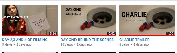
These are the three behind the scenes videos in which I made, I think in the future I should make more behind the scenes video and interviews with the cast and crew. This will help to make my website more visually engaging and entertaining to those using it.
|
Which elements of your planning were weak? How did this impact your production?
What would you do next time to improve the weaker elements? The area in which was weak within my planning was the behind the scenes footage. Due to poor planning I didn’t schedule in time to film behind the scene interviews and clips with the cast and crew, this is because my primary focus on set was getting the film finished. However, in the future I am learning from my mistake and organising set time to put a side for collecting footage for behind the scenes. Also, I didn’t even know what footage I needed and what video I was going to make out of the behind the scenes footage. When researching behind the scenes on short film websites I hadn’t gone into thorough detail about what was typically was seen in an video and if you had interviews. All this lead to me not capturing enough footage. This meant when creating a behind the scenes page on my website I struggled, I had to cut into the creation of the website time with filming interviews. This meant I was behind schedule in getting everything done for the website. To improve in the future, I would whilst filming my project get as much content as possible of set and prepare questions in advance to ask the cast and crew about film. This could really help you out when promoting you film and save you time and effort in having to re film footage when you are supposed to be putting everything together. |
|
Don't be afraid to discuss the good points of your work as well. Discuss why things worked particularly well. Explain how your work was adapted to your research/feedback etc and was therefore more successful.
I thought my promotional package was successful in terms of being engaging and interactive for the audience using it. This meant it would catch the audience’s attention for longer and thus be more successful in promoting the film. For example, I thought the gallery on the website worked really well, it had key images from my film and behind the scenes photos which I animated to move on the screen. In my survey I sent out asking for feedback on my website I received a lot of positive feedback on this page as it was very visually pleasing and worked effectively in show everything in the film. Another element in which I thought was successful was the lay out and the stylistic choices I made for it terms of fonts and images. Beforehand I received feedback on my survey saying that my font types were unclear and you couldn’t read them very easily. I took this feedback on and changed the fonts to bold black lettering, this meant it stood out and looked a lot better to look at. Making the website further accessible and easy to follow. I thought my trailer was done very effectively, I created a mock trailer to see the general base of the trailer. However, it wasn’t very effective in promoting the film, it was very miss leading about what the film was about and it didn’t follow typical trailer conventions such as title pages and dipping to black. In order to improve I did research into short film trailers, I analysing each trailer picking out the typical conventions they all shared. This gave me ideas on how to structure my own short film trailer, I added in: a montage, title pages and dipping to black effect. In the end the trailer was my favourite element out of the promotional package as I think it really captured the best bits of the film without giving too much away. The trailer will help in promoting the film further and getting the mass amount of people knowing about the film. |
This is the feedback in which I received via my survey. In order to improve my website I took on the ideas from the people filling out the survey.


The first image is what the Gallery looked like before I received any feedback from people and the second image is the after. This is my favourite page on the website due to it being the most engaging and interesting to look at, which is great at promoting the film. The success of this page lies down to the feedback which I got to make adjustments to make it better.
|
