Research
|
Words Hurt
This is an advert for anti-bullying, it shows the impacts words have on a person. They do this by illustrating what the physical impact of words would do to a person, if words could harm us physically. This allows the advert to be haunting and make the audience realise that their words can hurt people and change them for the better or the worse. This advert is a powerful tool in showing people if you haven't got anything good to say then don't say anything at all. Pathos and Ethos This advert causes an emotional reaction from the audience through the techniques of ethos and pathos. Pathos is shown as we empathise with this little girl, for example at 0:10 one of the bullies call this girl a loser and the word hits her across the face. We sympathise with this girl, as the audience we think back to a time where someone said someone mean about us and that it hit us around the face. As an audience we align with this little girl through our own past experience and in some way want to protect her. This makes the advert more powerful, due to us having an emotional connection with this girl. Ethos is also shown within the advert as we see the bullies as not being ethical and fair. The name calling they are doing is horrible behaviour as an audience we don't see the ethical side to it. Therefore, this means we want to get behind this company who is shining a light on these issues and help them in stopping this crime. The company seem reliable and honest in wanting to help make a stop to bullying through this campaign. As an audience we agree with this message and therefore are more likely in what they are saying and how we can help this issue. Slogan The slogan at the end of the video is 'Words Hurt. Don't be a part of it' this is shown as 0:28 in the advert. This is a powerful slogan as its very precise and to the point on the message they want to spread. The fact they say 'don't be a part of it' hints that they are directing the statement to the audience in an accusing manner. This makes the advert more serious as we begin to question our past behaviour and if we have ever said a mean comment to someone, this makes the audience really think and maybe stop them from saying questions in the future. |
Images
The images used in this advert are the girl who signifies vulnerability and pain, as the audience we align with this image, due to being in that situation before. We become protective of this girls character. Another image within the advert is the bullies, they signify the cruelty and what we are as society deterring away from. We do not want to become a bully so we to think before we say things. The bullies cause hatred and anger towards the audience, they are in a group of three yet this girl is on her own. These girls are being unfair and horrible. Overall, these images allow us to understand the problem at hand and for us to think we need to put a stop to bullying. Context The context of the video is about anti-bullying, the video is sharing to its audience how name calling and any form of bullying is wrong on all levels. We see the pain on the girls face as an audience we understand the negative impacts of bullying. Target Audience For this advert I think its targeting school children, bullying is most prominent through your child and teen hood. The fact the advert is set in a school it is showing just one example of bullying which occurs in school. This advert is warning school children on their behaviour in school and how their behaviour may effect others. The advert wants the school children targeted to empathise with the girl who is being bullied in order to make sure they are kind in school and don't follow bullies behaviour and become a sheep. They want a positive school life rather then a negative one, and by targeting children and young adults you are enforcing it through the advert and hopefully will see a result. |
|
Talent Show
This is an cyberbullying prevention advert with the key message being if you can't say something mean to someone's face then you shouldn't be doing it behind a computer screen online. This is due to the up rise in social media bullying has become a lot more prominent on social media such as Instagram and snap chat. The advert is trying to stop the people from cyberbullying as if they can't say stuff in the world they should definitely not be saying it online. Pathos and Ethos This advert works very effectively on using the advertising techniques of pathos and ethos. Pathos is shown as the audience pity and sympathise with the girl Paddy, at 0:10 you can see the smile on Paddy's face as she is somewhat honoured that this girl would talk about her. However, this is all ruined at 0:14 where Lindsey calls Paddy 'stupid', we see Paddy's face shift from happy to then horrified. We automatically empathise with Paddy and feel sorry for her, as an audience we want to protect Paddy from this abuse and make it stop. The comments are very harsh and make the situation very awkward, you can see from the audiences faces at 0:24 that they feel uncomfortable. As an audience we align with Paddy and feel sorry for the abuse she is on going. As well as the audience we feel bad for Paddy and pity the abuse she is enduring. Ethos is shown within the advertisement, as the company who created this anti-bullying campaign video are putting a stop to bullying. They are doing an ethical thing which will benefit society in the future. People put there trust in this company in order to save our society of bullying, they believe in what they are trying to achieve and will stand by them. This is a good technique in getting people behind the campaign and giving it that push to create a difference. People are more likely to trust them as they are reliable and will try to stop bullying of all kinds, especially on the internet. Slogan The slogan for this advertisement is 'If you wouldn't say it in person, why say it online?'. This is a very powerful slogan, from now watching the video we understand nobody would have the guts to stand in front of everyone and declare their hate and mean comments on another person, it makes them look bad. Yet, its a complete different world online, people can disguise themselves and hide behind fake profiles and computer screens in order to shield who they are or get more courage. This slogan is to reinforce cyberbullies know what they are saying is wrong so they do it online because that way they can get away with it more. The slogan is telling us if we can't do it in real life then we should definitely not be doing it online. The slogan is directing us as the audience through the word 'you' we now feel addressed personally and start to question our own past. Due to this we next time will think twice about commenting stuff online, if we can't say it to that persons face then don't do it behind their back or anywhere else. This is very powerful in spreading their message to the audience and getting them to understand the impacts of their words and hateful comments. |
Images
The use of the big stage Lindsey stands on is an image, it shows how by talking and posting on social media how many people are there listening and looking at it. Lindsey isn't declaring her hate to Paddy on a private message she is on a stage where everyone can hear, this shows that if you just talk on a chat room this isn't a real representation of real life. As an audience we are aware of the harshness of bullying today, Lindsey's image of hate as she speaks sweetly about mean things shows the cruelty of bullying. This juxtaposition makes us wary as an audience and want to put a stop to bullying. Context This context of this advertisement is cyberbullying, it's basically trying to tell its audience if you can't say hurtful and spiteful comments to someone face then don't do it online. Due to cyberbullying online becoming more prominent within society and old fashioned head in the toilet bullying being seen less. The campaign wanted to show that these people who are bullying are pretty timid if they can't do it in real life so shouldn't be doing it at all. Target Audience The target audience for this advert is for young people who uses social media regularly. It is showing them they cannot go on to the internet and spread hateful comments to others. Because children of today have grown up on an online world bullying would happen online too, yet they are trying to show that if they can't say anything in real life then don't post anything online. They are targeting it to young people of today as this issue is more likely to affect them due to technology getting more advanced, they want to warn people of their actions before they do it them. |
Planning
|
|
|
Slogan
I chose this as my slogan for the advertisement as the direct personal pronoun 'your' addresses the audiences personally. Its reaching out to the audience in an accusing manner to make the audience feel guilty for their past actions, therefore they are more likely to stop in the future. I also chose the word 'hurt' within the slogan to reflect back at the advert and how this girl was abused physically by the comments being said. Yet, this is a metaphor for the inner struggles of being bullied and the effect the words have on you as a whole. The slogan shows the audience if you saw this girl like within the advert bleeding and in pain you would probably stop, yet due to bullying being an inner struggle which affects the victim’s mentality we as a society don't stop I decided to have three words in my slogan to make it snappy and powerful to the audience. |
My Advert
Evaluation
|
In the making of my anti-bullying advert I wanted the advert to be powerful and shocking to the audience due to the use of blood, cuts and bruises. I used pathos in order to make the audience empathise with my characters pain and torment, I wanted them to align with her and feel almost protective over her. I thought the concept of my advert was very simple, every time the girl gets a text message with a hurtful comment she gets kicked and attacked. Yet, I did this to create an impact through shock from the audience.
|

Colour
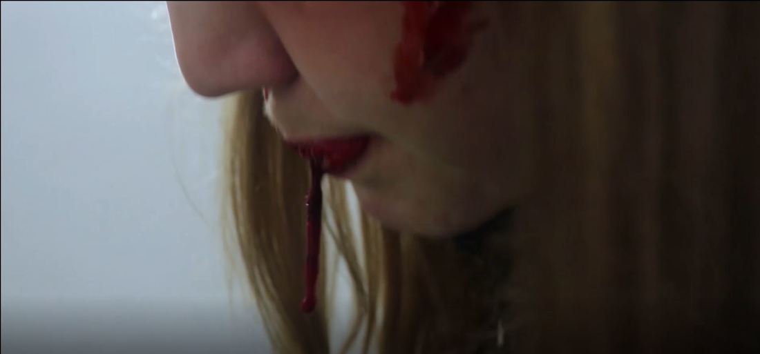
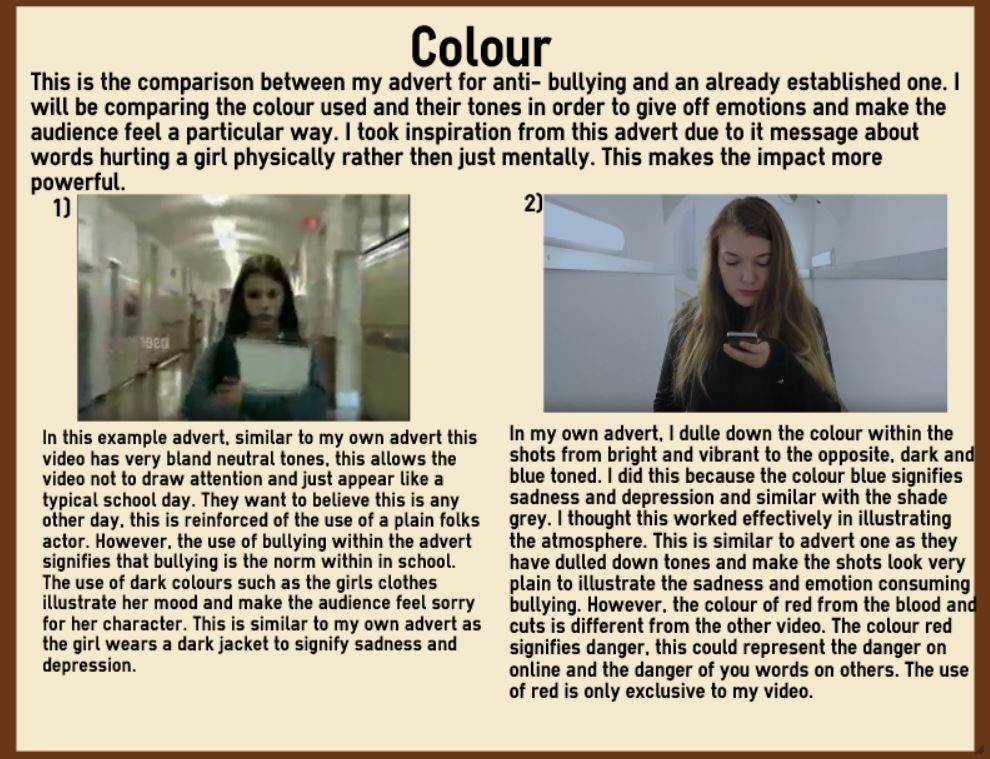
The colour of my advert is very blue tone and cold looking, I colour corrected the entire thing to make it seem colder rather than warmer. I did this because of the sign of cold tones signify sadness and being depressed which I want to reflect as the mood and atmosphere of the advert. I want the audience to empathise with this girl (Pathos) and really feel for her in her time of struggle. Blue can also signify death which works really effective as we should her being beaten up and how she is dead to the world. The use of the cold and white colours wall in the room reinforce the idea of entrapment, not only in the room she is in but on social media. The girl is trapped within a cycle of bullying, the harsh gradient of the colours show all the impacts of the words in their true harsh form, getting beaten up. In the future to improve this use of colour, I would when correcting make the scene darker colour as well as it being blue due to this creating more of an atmosphere of darkness and sadness. The dark colours would signify my characters loneliness and the pain they are going through. I used other colours within my advert such as the continuous colour of red, from the blood, this contrasts completely with the blue and therefore reinforces the bloodshed and makes the scene appear more graphic and haunting. The colour red signifies danger and tragedy caused around cyber bullying, this could also give us an insight to our female character mind set. Due to the audience understanding the meaning of these colours they will react more and empathise with our character more. The use of red from the blood could have been improved by having more of it, especially during the scene where the girl spits out the blood, instead of it just dripping to the ground it could have sprayed in the air to give of a more impactful effect and really make the audience empathise with her. Blood spraying everywhere will be more effective especially as it follows the line ‘Why don’t you just go and kill yourself’ at 27 seconds into the advert. This will make the audience respond more and really begin to want to make a change.
|
|
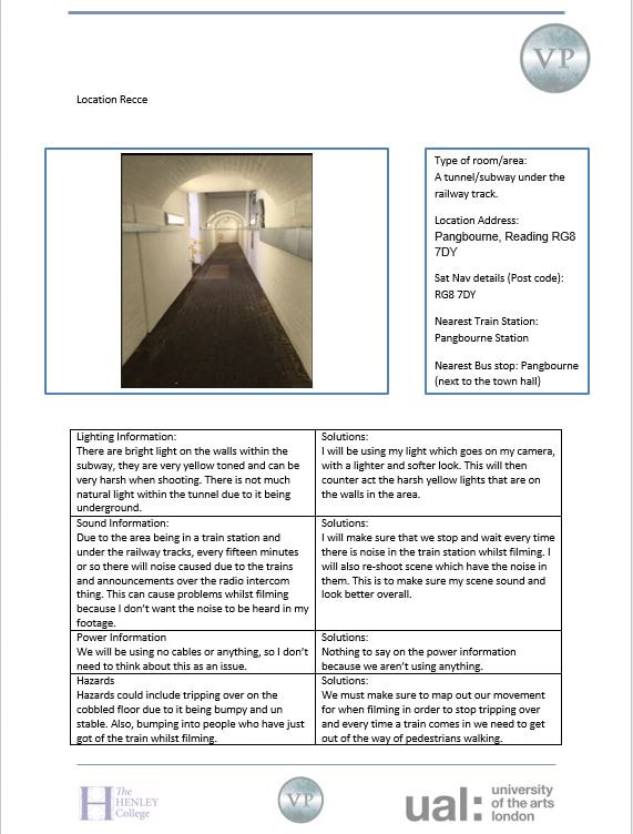
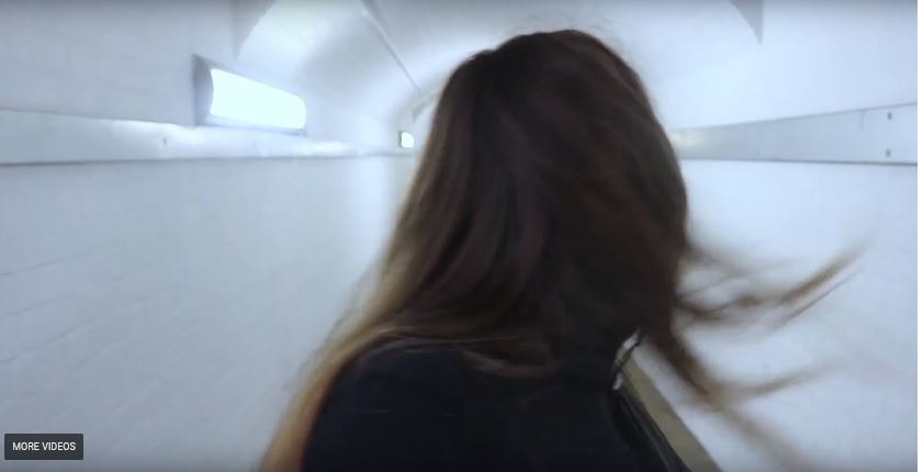
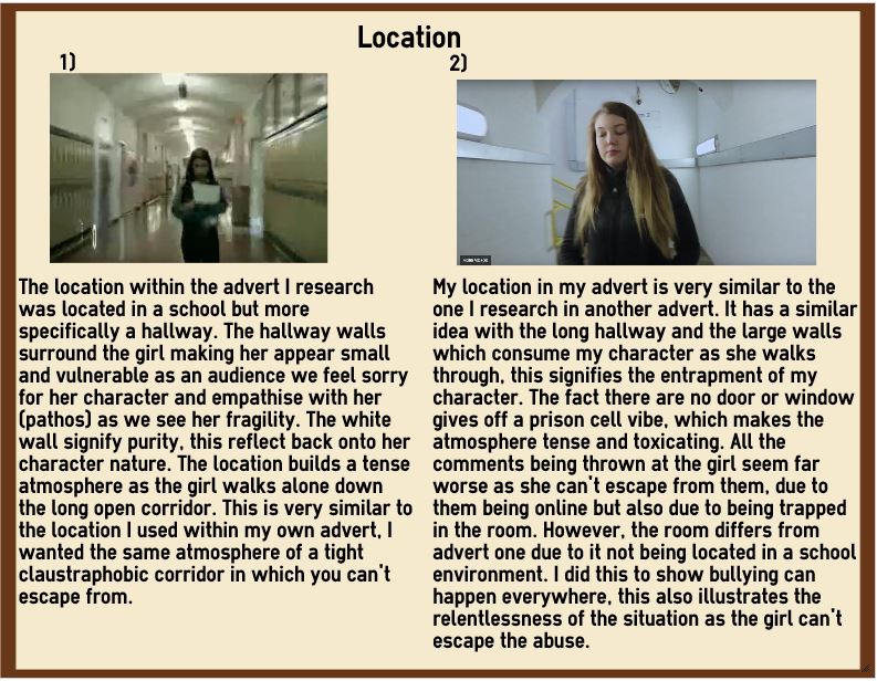
Location
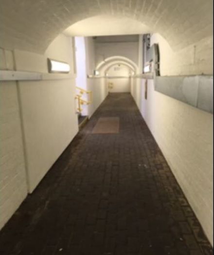
The location was the underground tunnel/subway at Pangbourne station, I thought this location was a good place to use due to it looking very haunting and creepy, especially at night. The location itself, makes the audience appear weary as it looks empty and alone which is completely out of place for a train station which have many people go through on the daily. I wanted the girl to look trapped as the large white walls consume her and cover her up. This sign could signify the effect of bullying on social media has on a person, it consumes you and makes you feel trapped and helpless. I thought it was effective in using a location outside a school or college, it shows that bullying is everywhere and that you can’t escape it, this is all down to social media. This sign could signify the relentlessness of bullying as a teenager or child in the 21st century. The tunnel is completely white which works effective due to it contrasting with the red blood, this could signify the hate that we choose not to see in the world. However, due to filming in a train station it was very busy and I didn’t want any pedestrians being in the shots of my footage. This became a challenge as I had to keep stopping and starting to make sure that nobody was in my shots, this took a lot of time up especially because we filmed at mid-day. To solve this problem next time I will film at a less busy on peak time of day. This will allow the filming process to be a lot smoother and successful. Also, to make my film more engaging I could have used more than one location due to only using one in my advert. This could have made my advert more visually pleasing, yet this could have ruined the impact of my film.
|
|
|
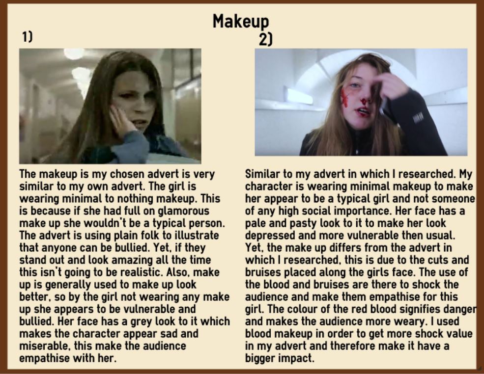
Makeup
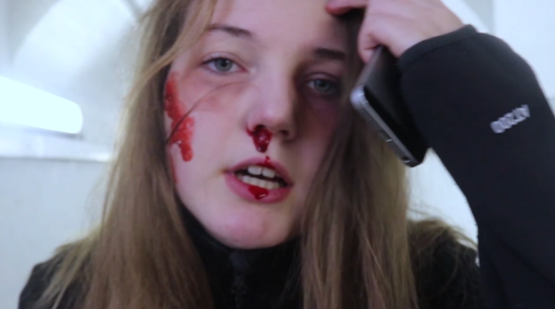
Within my advert I used a lot of blood and bruises make up, I did this in order to shock the audience and to illustrate the impact of their words on people. I wanted the cuts to signify the hateful comments and the girl’s pain (screams) to represent her reaction and her inner feelings. I thought this worked effective, the gruesome nature of the cuts and bruises made the advert much more realistic. This created an emotional reaction from the audience, due to them feeling helpless in helping this girl, they see the pain she is going through and just have to sit and watch it (pathos). This makes the advert in some way very sadistic and hard to watch as the audience empathise with this girl’s character and just want to help her. The blood of the cuts is bright red this could signify the dangers around social media in terms of bullying. The girls face is illustrated as pale and pasty which contrast to the bright coloured blood smeared across the girls face, this signifies her destruction and her break down. The grey colour on her complexion signifies her depression and her sadness form these harsh messages. Overall, to make this more effective at the end, at 0:29, when she spits out blood after the line ‘Kill yourself ‘I would want the blood to spit higher in the air and less of it, I think this will more effective and give off the look as if she has been punched in the stomach. I think this would have made the shot more realistic. Also, if I was filming this again I would more cuts and bruises to make her image even more terrifying for the audience as this will create more of a shocking response and really make the audience be convinced to stop online bullying.
|
|
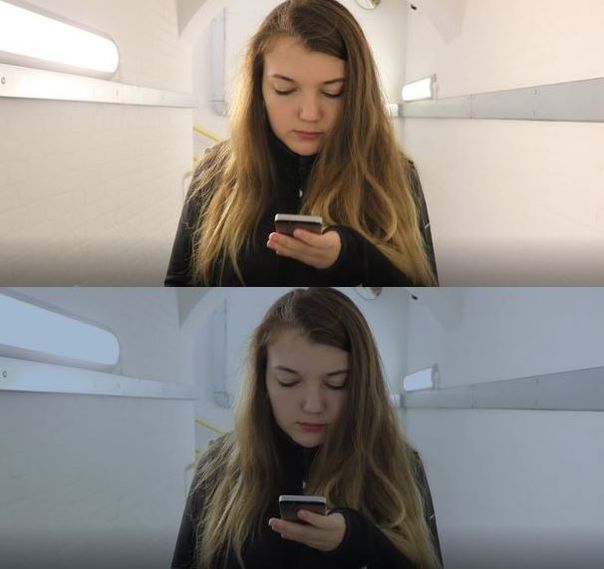
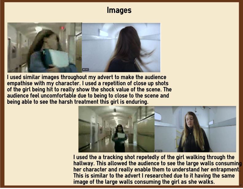
Image I repeatedly used close up shots of my characters face in moment of her pain to show her emotions closer up, this worked in creating an emotional impact. Due to us seeing the image of the typical girl, using the technique of plain folk, pushed against the wall (0:10) and being smacked (0:20) we pity her character. The audience begin to align with her character and engage an emotional relationship for her. The audience want to help her, yet they can’t, thus making the advert uncomfortable and painful to watch. Due to her being an average girl it also makes the audience feel protective over her due to this girl could be anyone, the audience members themselves or even family and friends. The image of the blood worked successfully, we see it towards the end of the film where the girl gets hit and she is staggering (0:24), the image is shocking and creates pathos for the audience due to the blood signifying death and pain. The audience just must watch the girl push through the pain feeling completely helpless, this creates a feeling of guilt amongst them. To improve for next time, I would have liked to get more images of the girl with blood over her, due to this creating shock value for the audience and making the advert more gripping to watch. Even though I still have a lot of blood I think the more horrifying the shots and images are the more people are going to remember the advert and be persuaded to be nicer online. Also, when filming the close up shots I would of held the shot for a longer duration to make it more intense and reeling for the audience.
|
|
|
Language
I used language in my advert to create an emotional impact with the audience and make them empathise with my main female character. The language used within the advertisement are the layers of voices overs such as ‘I’m not trying to be rude but you look like a whale’ which is at 0:03 and ‘Er, why would you post that?’ at 0:08. These layers of sound make the scene much more powerful. I thought it worked successfully how I built the sound up witht the audio, to start of with I had only a few mean comments yet by the end all the mean comments are being said over one another. I did this to signify the never ending struggle and torment endured by bully which really allows the audience to empathise with the girls character (pathos). However, I filmed these audio clips by using my phone which didn’t make them as sharp and clear as I would have liked the audio and language to said through. To improve this in the future I would use my actual camera to collect audio due to it being better than a phone and being able to be able to pick up the spoken language better. I also used the line ‘Sticks and stones will break my bones, but words will never harm me’ respectively throughout from 0:06-0:28 and eventually at 0:29 the voice says ‘they will always harm me’ I thought the repetition of this light could be symbolic of the girl telling herself that everything is alright and that she can just ‘deal’ with the bullying yet at the end she admits defeat. I thought this phrase worked effectively with the advert as it bring an insight to the victims approach on the situation, as the audience they can align with her and see her vulnerability against this situation. To improve this in the future I would makes the audio louder in order for it to be heard easier by the audience, this will make the scene more heart breaking to the audience as they can here the girl and want to help her.
|
|
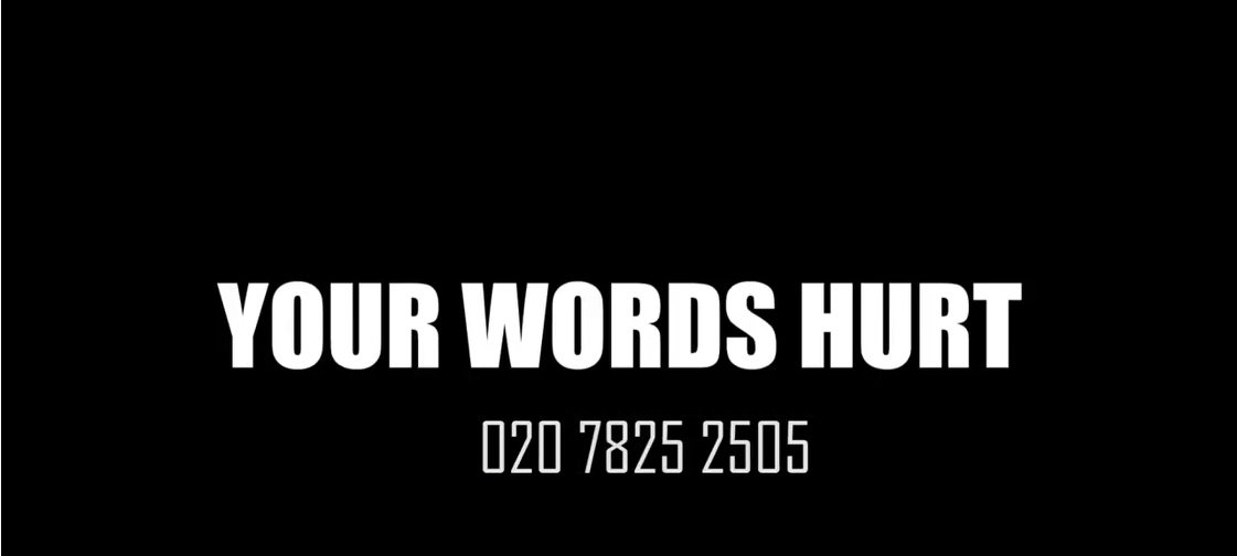
Slogan
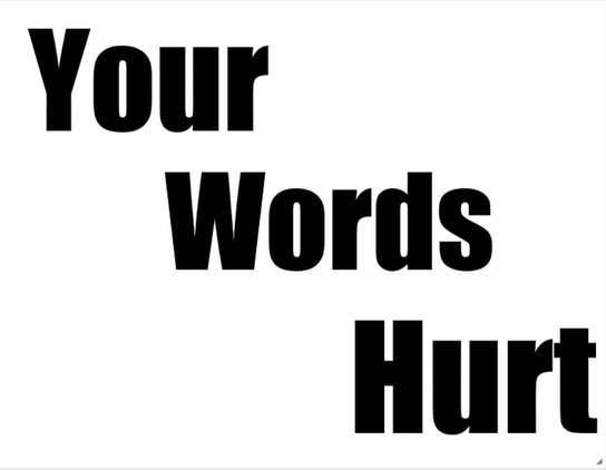
The slogan for my advert is 'Your Words Hurt', this personal pronoun directs the audience personal. This sign makes the audience feel personally blamed like they have done something wrong. It makes them feel guilty for their past actions, this creates a feeling of guilt and empathy for the people enduring bullying (pathos) as an audience they want to protect anyone from harm. The word 'hurt' signifies the trauma and pain which is inflicted due to a few mean comments, this sign allows the audience to understand the power of the their words and how they can change someone. This is a negative idea of transfer as they are suggesting that their mean comments are causing hurt and distress onto their victims. The fact that I have used a typical normal girl within the advert reinforces the idea of plain folks and how this girl could be anyone, the face of all teenagers. This adds to the slogan impact due to our own words have caused suffering and pain on to many and how we should in the future keeps our negative comments to ourselves. The bold lettering makes the statement seem strong, the harsh reality of the situation, I want the message to be clear that we need to be nicer online, the fact its straight to the point and can be seen as harsh will create a better reaction amongst the audience as they will in future be ore weary of their words. The only thing I could improve with this slogan and title screen is the fact that the title is on for a very brief amount of time, from 28 seconds to 29 seconds, if I want the audience to be able to read my slogan with enough time to create an impact I will have to have the slogan on screen for longer. Therefore, the whole advert will create meaning and make a bigger impact on the audience.
|
|
Class Evaluation
The two main bits of negative feedback which I got back from the class were about the audio on my video and the title screen at the end of the advert. The class said I needed to improve the audio on my video due to it not being clear what the voice overs are saying. Within my advert I used layers of voice overs speaking harsh comments such as 'Not trying to be rude but you like a whale' in 3 seconds into the video, these voice overs over lay each other to give off a chaotic feel to the advert and make it feel very intense. As well as this I have another voice over saying 'Sticks and stones may break my bone but words will never hurt me' throughout form start to finish. This makes the video very intense and very powerful. Yet some of this impact is lost due to you not being able to hear the voice overs because some are a lot more quiet then any others. To improve this I will change the audio gain on the video files to a higher amount to allow the voice over to be heard clearer and allow the intensity and the power of the video to be kept in tact. The second bit of negative feedback was about the title page at the end of the video (29 seconds in). The class said this title was on for a very brief amount of time and because of this it was hard to read. To improve this I will increase the shot duration of the title screen to make it longer so the audience cans see the slogan and the contact information, due to the contact information being the most important part of the video and it being crucial for people getting help.
The positive element of the advert was the location. The class said I went out my way to find an effective location, the location I picked looked claustrophobic and as if it was trapping my girl who was in it. The fact that the large white walls tower over her make the character look vulnerable and attacked. This worked in effective in allowing the audience pity her character and really feel for her. Another positive feedback was the use of make up in the video, the blood and cuts worked effective in making the audience really pity the girl and see the harsh treatment in which she is enduring. I had to do a lot of research into doing effective makeup which wouldn't look fake, so the fact that this looked good on camera makes me especially happy with the outcome. Another bit of positive feedback was about the sound that I used, I used a sound track called 'When heroes walk amongst us' and I used different layers of voice overs such as mean comments and the girls own voice. I also used sound effects such as the slapping of the girls face at 22 seconds into the video. All these sounds layers make the video more powerful and work effective as we really feel and see this girls emotional journey portrayed on screens. The sound gets too much and you just want it too stop, just like the girl enduring the bullying. We get an insight into the girls emotions and therefore this works very effective in sending this message.
The positive element of the advert was the location. The class said I went out my way to find an effective location, the location I picked looked claustrophobic and as if it was trapping my girl who was in it. The fact that the large white walls tower over her make the character look vulnerable and attacked. This worked in effective in allowing the audience pity her character and really feel for her. Another positive feedback was the use of make up in the video, the blood and cuts worked effective in making the audience really pity the girl and see the harsh treatment in which she is enduring. I had to do a lot of research into doing effective makeup which wouldn't look fake, so the fact that this looked good on camera makes me especially happy with the outcome. Another bit of positive feedback was about the sound that I used, I used a sound track called 'When heroes walk amongst us' and I used different layers of voice overs such as mean comments and the girls own voice. I also used sound effects such as the slapping of the girls face at 22 seconds into the video. All these sounds layers make the video more powerful and work effective as we really feel and see this girls emotional journey portrayed on screens. The sound gets too much and you just want it too stop, just like the girl enduring the bullying. We get an insight into the girls emotions and therefore this works very effective in sending this message.
Comparison
|
|
|
|
